Showing posts with label printing. Show all posts

Tuesday, 15 November 2011

To Paraphrase Noddy Holder, It's (Not Quite) Christmas


To paraphrase Noddy Holder, it's (not quite) Christmas, but I've been busy listing lots of gorgeous vintage greetings cards on Etsy.

My grandfather worked for a greetings card company in Preston, Lancashire, UK for forty years. When the company closed, he bought the original sketches and drawing that the cards were printed from. Most date from the late 1940s and early 1950s. Sadly, the drawings are largely anonymous, being done by commercial artists employed by the company. He gave me an old suitcase full of these, and a good many more, from sentimental mottos to tall ships in full sail to kitschy cottage gardens.

Fab, aren't they?

Saturday, 12 November 2011

John Bull Special

New eBay purchase ... A nostalgic treat to myself, as there was a set at my Nanna's for the cousins to share. Grandad was a litho printer, you see. We used to print and draw on paper samples and offcuts.

It was pre-owned by some small boy called Philip, and hails from, of all places, Chorley, Lancs, my birthplace. I feel I was destined to own this.

Love the 'John Bull' font: the rubber type is more like a pre-Helvetica simple sans serif.

Prepare for many a handprinted birthday-slash-Christmas card, friends and acquaintances!

Sunday, 23 October 2011

Just My Type


I've been savouring Simon Garfield's book about fonts and typography Just My Type. 

I am a self-confessed type geek - not sure if its down to granddad being a printer all his life or just my obsession with books and words. This is like a holy book. Garfield's thesis, so far, seems to be the importance of the relationship between type and meaning, rather than type and syntax.  The book is a tour of the history of typeface and issues and anecdotes beyond.

How can you not love a book that has as an epigraph a story about a printer's apprentice who set his lover's name in type and swallowed it? And he devotes an entire chapter to my favourite character (and close contender for my favourite English language word), the ampersand! My hero.

He begins with a discussion of the Marmite font, Comic Sans, which attracts a fair amount of vilification and scorn in the font world. Comic Sans is widely used - for the ropier side of home desktop publishing, yes, I mean you church newsletter writers - and is widely despised, as the Ban Comic Sans website shows.

I do dislike Comic Sans myself, for its ubiquitousness and for its blandness - ok for comic books, not ok for medical leaflets and powerpoint - and because it's just not that appealing a design. But I was reminded, while reading, that it has its uses: we used it frequently when I taught ESOL in Manchester for students who were illiterate or unfamiliar with the Roman alphabet, as it closely resembles handwriting and has no confusing serifs or formally shaped letters like 'g' and 'a'. I think it is also used for dyslexics as well.

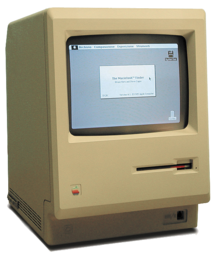
I was also reminded of the sheer joy of playing with fonts. I was a kid when the Apple Mackintosh was born and my computer geek dad had one of these:


I think we forget now how revolutionary the visual nature of the Mac operating system was - surely the late Steve Jobs's real legacy? Me and my best mate, the Pink Floyd fan (yes, you!), would play around on it for hours constructing newspapers and writing stories, making full use of the entire range of fonts available. San Francisco for the ransom notes, and Gothic for anything 'antique', of course. Happy days.


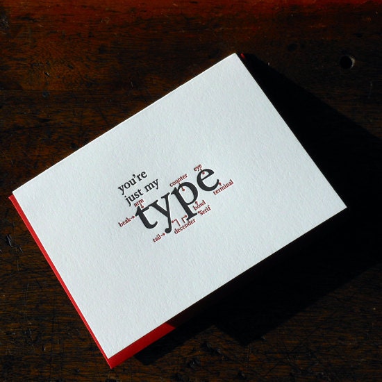
On the same theme, I just love this witty greetings card, a recent Etsy find ...


Sunday, 19 April 2009

Women of the world, to the Presses!


A colleague, Steve, who is something of a technical expert in the world of printing and a 'history of print' buff, put this photo on my desk the other day with an accompanying note which read "Women in the composing room, whatever next?"

A bit of background followed, explaining that at the time - around 1860 - women were not employed in printing presses. One social reformer, Emily Faithfull, who was part of the Langham Place Group and dedicated to campaigning for education, employment and suffrage for women, however, believed that composing was a suitable skill for women to learn to enable them to gain respectable occupation.

She then set up a printing works called the Victoria Press, where women were employed as compositors. There was some backlash from the (all-male) print unions, with sabotage and tricks played, but the press went on to great success.

I like to think that we're part of this legacy, although the picture has changed dramatically, and that were here thanks - in part - to Emily Faithfull's vision of skills and training as the solution to bringing women out of the domestic sphere and into the more politically significant world of work.

Read more about Emily Faithfull here.

Interestingly, she died and was cremated in Chorlton-cum-Hardy - I wonder her ashes lie in Southern Cemetery!

LinkWithin

Blog Widget by LinkWithin