I've been savouring Simon Garfield's book about fonts and typography
Just My Type.
I am a self-confessed type geek - not sure if its down to granddad being a printer all his life or just my obsession with books and words. This is like a holy book. Garfield's thesis, so far, seems to be the importance of the relationship between type and meaning, rather than type and syntax. The book is a tour of the history of typeface and issues and anecdotes beyond.
How can you not love a book that has as an epigraph a story about a printer's apprentice who set his lover's name in type and swallowed it? And he devotes an entire chapter to my favourite character (and close contender for my favourite English language word), the
ampersand! My hero.
He begins with a discussion of the Marmite font,
Comic Sans, which attracts a fair amount of vilification and scorn in the font world. Comic Sans is widely used - for the ropier side of home desktop publishing, yes, I mean you church newsletter writers - and is widely despised, as the
Ban Comic Sans website shows.
I do dislike Comic Sans myself, for its ubiquitousness and for its blandness - ok for comic books, not ok for medical leaflets and powerpoint - and because it's just not that appealing a design. But I was reminded, while reading, that it has its uses: we used it frequently when I taught
ESOL in Manchester for students who were illiterate or unfamiliar with the Roman alphabet, as it closely resembles handwriting and has no confusing serifs or formally shaped letters like 'g' and 'a'. I think it is also used for dyslexics as well.
I was also reminded of the sheer joy of playing with fonts. I was a kid when the
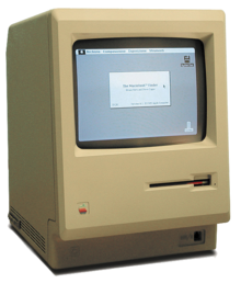
Apple Mackintosh was born and my computer geek dad had one of these:
I think we forget now how revolutionary the visual nature of the Mac operating system was - surely the late
Steve Jobs's real legacy? Me and my best mate, the Pink Floyd fan (yes, you!), would play around on it for hours constructing newspapers and writing stories, making full use of the entire range of fonts available.
San Francisco for the ransom notes, and Gothic for anything 'antique', of course. Happy days.
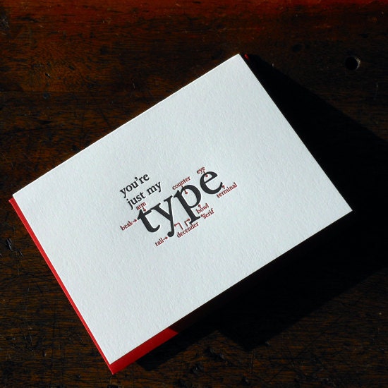
On the same theme, I just love this witty greetings card, a recent Etsy find ...